Vector Artwork to Jacquard Stitch: Preparing Your Logo for Custom Sock Production
Moody2026-09-16T11:05:24+03:00Your logo file is perfect. Infinite scalability, clean Bézier curves, a locked-down Pantone palette, hairline rules at 0.25pt that give the mark its precision.
Then it goes to a sock factory, and the proof comes back looking like a screenshot from a 1994 video game.
This is the single most common source of revision cycles in custom knitted merch, and it costs North American brands weeks every autumn. The good news: it is entirely avoidable. You just have to stop thinking in vectors and start thinking in needles.
The Hook: Resolution Is Not Yours to Choose
In print, you control resolution. In knitting, the machine does.
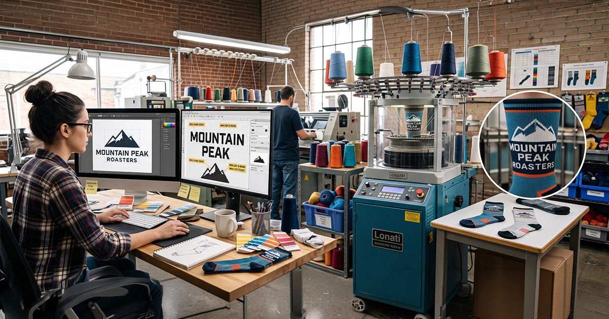
A circular sock knitting machine has a fixed number of needles in its cylinder. Common configurations run 144, 168, or 200 needles. Each needle produces one stitch per rotation, and each rotation produces one row (a course). That’s your grid. It is not negotiable, it doesn’t scale, and it exists before your artwork does.
Practically, on a fine-gauge 200-needle machine:
- Horizontal resolution: roughly 18–22 stitches per inch, so one stitch is about 1.2–1.5 mm wide
- Vertical resolution: roughly 15–18 rows per inch, so one row is about 1.4–1.7 mm tall
- Drop to a 144-needle machine (common for thicker, cushioned athletic socks) and you lose close to a third of that detail
Two consequences follow, and both surprise designers the first time:
The grid is not square. A stitch is wider than it is tall, at roughly a 1.2:1 ratio. A perfect circle mapped naively onto that grid comes out as an egg. Good factories compensate in their punching software, but you should always ask to see a stitch-grid proof rather than a flat digital mockup, because that’s where the distortion shows up.
Your usable canvas is small. On a standard crew sock, the clean front leg panel is realistically about 60–70 mm wide by 60–80 mm tall. That’s roughly 50 stitches across. Fifty. Every decision below flows from that number.
Think of it as designing a favicon that someone will stretch over an ankle.
Rule One: 5–6 Colors, and Here’s the Physical Reason Why
Most factories cap you at 5–6 yarn colors, and designers often read that as an upsell tactic. It isn’t. It’s a comfort and durability constraint.
In jacquard knitting, every color active in a given row is fed continuously around the entire circumference. Where a color isn’t showing on the face of the fabric, it runs along the back as a float. Add a sixth and seventh color and you are stacking multiple layers of yarn behind the design panel.
What that produces:
- A thick, boardy patch on the inside of the sock that the wearer feels against the shin or the arch
- Loss of elasticity, because floats don’t stretch the way knitted loops do. The sock stops recovering and starts sagging
- Snag risk, as long floats catch on toenails and fingers during wear
- Heat retention in a product people wear inside shoes
There’s a related rule that catches people out: maximum float length of roughly 6–7 stitches, about 8–10 mm. If a single color disappears from the surface for longer than that, it has to be tacked down with a tuck stitch, which can show faintly on the face. That means wide areas of a single flat color with one small accent color floating behind are often harder to knit cleanly than a busier pattern.
The workaround for richer palettes is not more colors, it’s smarter ones:
- Use heathered or marled yarns to introduce visual depth at zero color cost
- Simulate a midtone by checkerboard dithering two existing colors at the stitch level, which reads as a blend from normal viewing distance
- Reserve your brightest accent color for a small area, where the float distance stays short
And critically: specify color in Pantone TCX, the textile cotton standard, not TPG, TPX, or coated C. Yarn is dyed, not printed. A coated Pantone chip and a dyed cotton yarn will never agree, and arguing about it in October is a bad use of everyone’s time.
Rule Two: Typography Micro-Rules
Type is where most proofs fail. A 50-stitch canvas is brutal on letterforms.
Minimum cap height: 8 rows absolute, 10–12 rows recommended. In real units, that’s about 12 mm minimum and 15–18 mm for anything you actually want people to read across a room. Below 10 mm, you are knitting suggestions of letters, not letters.
Minimum stroke weight inside type: 2 stitches. A one-stitch stem is a single column of loops. It will read as a dotted line, drift diagonally, or vanish entirely depending on tension. Three stitches is the safe number for knockout (reversed-out) type, because negative space closes up faster than positive space does.
Bold sans-serifs only. Think Helvetica Bold, Gotham Bold, Inter SemiBold and heavier. Geometric sans faces with even stroke weights survive the grid best.
Avoid, without exception:
- Fine serifs and slab serifs with delicate brackets, since a serif smaller than 2 stitches simply disappears
- High-contrast typefaces like Didot or Bodoni, where the thins evaporate and the thicks look clumsy
- Script and handwriting fonts, where connecting strokes merge into blobs
- Tight tracking, because adjacent letters bleed together. Open your letterspacing by 5–10% over your print spec
- Extended taglines. If your wordmark has a 6pt descriptor line beneath it, drop it for the sock version
Convert all type to outlines. Every time. Font licensing, missing fonts, and version mismatches on a factory workstation cause silent substitutions that nobody notices until the sample ships. Outline it, then send a flattened JPG reference alongside so the factory can verify nothing shifted.
One more that saves arguments: knitted type on a leg panel is viewed on a curved, stretched surface. Horizontal letterforms widen when worn. If legibility is mission-critical, ask for a worn-on-leg photo of the sample, not a flat-lay.
Rule Three: Line Weight and Detail Limits
The same logic applies to everything that isn’t type.
- Minimum line weight: 2 stitches, roughly 2.5–3 mm. One-stitch lines are lost or bleeding stitches. Don’t specify them
- Minimum gap between elements: 2 stitches. Closer than that and two shapes fuse into one
- Minimum standalone shape: 3 × 3 stitches. A registered trademark symbol, a single dot in a pattern, or the counter inside a lowercase “e” all need to clear this bar
- Expand all strokes to filled paths before sending. A 1pt stroke means nothing to a knitting program; a closed shape with real width does
Diagonals and curves stair-step. There’s no anti-aliasing in yarn. A 45° diagonal renders cleanly because it steps one stitch per row. Shallow angles, say 15–20°, produce long visible jogs that look like mistakes. Where you have a shallow curve, consider redrawing it as a deliberate stepped shape so the “pixelation” reads as intentional.
Gradients, drop shadows, glows, transparency, and blend modes do not exist. There is no halftone in knitwear. Every one of these will be flattened into hard-edged blocks by someone at the factory who is guessing at your intent. Do that flattening yourself, on purpose.
Simplification technique that works: open your logo at 40 × 40 px in Photoshop with nearest-neighbor resampling and no smoothing. That’s approximately what the machine sees. Whatever survives is your design. Whatever doesn’t, redraw or remove. This five-minute test prevents more revision rounds than any other single habit.
Placement matters too. Avoid putting critical detail on the heel, the toe, or across the cuff-to-leg transition. Those zones involve stitch count changes, reciprocating motion, and heavy ribbing, all of which distort artwork. The outer leg panel and the ankle side panel are your reliable real estate.
The Frictionless Hand-off Checklist
Save this. Run it before every submission. It is the difference between one sample round and four, and in Q4 that’s the difference between delivering in time for the holiday party and apologizing in January.
File format
- Vector file supplied: .PDF, .AI, .EPS, or .SVG
- All type converted to outlines
- All strokes expanded to filled shapes
- No gradients, transparency, blend modes, drop shadows, or effects
- No embedded raster images
- Layers named clearly by color
Scale and geometry
- Artwork built at 1:1 physical size in millimetres
- Every line and internal stroke at 2.5 mm or wider
- Every gap between elements at 2.5 mm or wider
- No standalone element smaller than 4 × 4 mm
- Minimum cap height 12 mm, ideally 15 mm or more
Color
- Total color count at 6 or fewer, including the sock body color
- Every color named with a Pantone TCX code
- Flat spot colors only, no tints or percentages
- No area requiring a float longer than about 10 mm
Verification
- Nearest-neighbor 40 px test run and passed
- Flattened JPG reference included so the factory can confirm intent
- Placement zones specified, avoiding heel, toe, and cuff transition
- Simplified fallback version supplied in case the primary mark won’t hold at gauge
- Stitch-grid proof requested, not just a flat mockup
One last piece of scheduling advice. Custom sock production for North American delivery typically needs sampling approved 2-3 weeks ahead of the in-hands date, and every revision round adds 5–7 days. If your logo is going on socks for a December event, your artwork conversation should be happening now, not after the purchase order clears.
Design for the needle, not the pixel, and the sample comes back right the first time.
Socks Sprites builds custom knitted merchandise for brands across the US and Canada. If you want your existing brand assets reviewed against these constraints before you commit to a run, send them over. Sanity checks are free and cheaper than a reknit.